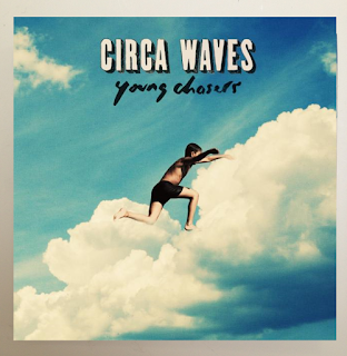
This is an example of a more abstract digipak. There is very little detail being given within the pack and it focuses more on the graphical and aesthetic elements. This digipak also has a more uplifting and playful feel to it which reflects the mood the music within inspires. A sky photo is consistent throughout the piece creating a nice flow throughout. The blue sky has connotations with summer which invokes a very positive time. On the front cover is the band logo followed underneath by the name of the album. The logo of the band is very bold and outstanding, being a san serif font, it clearly stands out from the rest of the cover. The album title is more understated and is a serif font which differs to the previous digipaks I have looked at. The font is almost handwritten which gives a more vintage appeal to the album making it more personal and looking less professional/ commercial. I think this inspires a more humble feel to the album which the intended audience would appreciate.
Inside the pack the photo continues seamlessly which continues the theme. In addition further characters and graphics are inserted over the top of the background photo. This further personalises the album and gives a more homemade feel, with abstract styling. Once again this would appeal to the audience being more interested in the unique style of the genre that is alternate to the general chart style music the majority of people would be interested in. Within the digipak there is no reference to the artist visually and in addition there is no text or further information regarding the band or album. This creates a more aesthetic focus towards the digipak making the buyer want to listen to the CD to reveal its contents. This Circa Waves digipak is designed to reflect on the music so ,due to the positive tone the music inspires, there is use of very vibrant colours associated commonly with happiness and summer. Retro characters are placed onto the background to help further enforce the retro feel to the bands sound, it also creates a positivity surrounding the album.
The back of the digipak unsurprisingly is no different to the rest of the pack. It consists of the same vibrant photo of blue summer sky. The back is the only part of the digipak where we are made aware of information about the contents of the CD. The back consists of the same serif font as the front which provides continuity to the digipak. The back consists of a central list naming all the songs within the album. Overall I really like the look to this piece and think I will be able to take inspiration from it when creating my Digipak.
Magazine Advert
Once again I did not want to steer too far away from existing conventions for my magazine advert however continued with the theme of a lack of iconography which is less common with my genre for the magazine adverts.


No comments:
Post a Comment